Researching Homelab Dashboard Solutions and Choosing Dashy
After setting up monitoring with Uptime Kuma, I needed a central dashboard to access all my homelab services and documentation. The goal was to create a homepage that would serve as the entry point to the homelab, with automatic integration of service links and the ability to embed documentation diagrams.
I’d seen several self-hosted homepage solutions mentioned in homelab communities, but I wanted to evaluate the options systematically. Each solution has different strengths and approaches. I needed something that could integrate with my infrastructure-as-code workflow and support custom widgets for Mermaid diagrams.
The evaluation process helped me understand what makes a good homelab dashboard and why the architecture choices matter for long-term maintenance.
What I was looking for
Self-hosted capability was essential. Everything needed to run on my Proxmox cluster, with full control over data and no external dependencies.
Widget-based architecture was important. I wanted to embed Mermaid diagrams from my documentation, which meant the solution needed to support custom HTML or iframe widgets. Static link collections wouldn’t be enough.
YAML configuration would integrate well with my infrastructure-as-code approach. If the dashboard configuration could be generated from state files, it would stay synchronized with service deployments automatically. JSON would work too, but YAML is easier to read and maintain.
Resource efficiency mattered to some degree. The solution would run in an LXC container following my one-container-per-service architecture. While resource usage wasn’t the primary concern, it needed to be reasonable for a homelab environment.
Dynamic service discovery would be ideal. Rather than manually maintaining a list of services, I wanted the dashboard to pull service information from my state files. This would keep the dashboard up-to-date as services are added or changed. However, none of the solutions I evaluated could automatically detect all services from my infrastructure configuration, so custom automation would be necessary.
A clean, user-friendly interface was important. This would be the entry point to the homelab, so it needed to be easy to navigate and visually organized. Good categorization of services would help with discoverability.
Evaluating the options
I looked at several self-hosted homepage solutions to understand what was available. Each had different approaches to configuration, customization, and architecture.
Homer is a simple static homepage solution. It’s lightweight and straightforward, with YAML configuration, often using minimal resources compared to Dashy. But it focuses on static links and doesn’t have strong widget support for embedding custom content like Mermaid diagrams. The simplicity is appealing, but it lacked the customization capabilities I needed.
Flame is another self-hosted startpage option. It has a modern interface and good customization options. However, the widget support for custom HTML and iframes wasn’t as robust as I needed. The configuration approach was also less aligned with generating from state files.
Homepage by benphelps is a modern solution built with Next.js. It’s actively developed and has a polished interface. It has some service discovery features with automatic detection of certain services, but it doesn’t cover everything I needed. The widget system for custom content wasn’t as flexible as I needed for embedding Mermaid diagrams. Homepage is actually more resource-efficient than Dashy, often using around 50-100MB of RAM compared to Dashy’s 200MB-500MB+, but resource efficiency wasn’t the deciding factor for my use case.
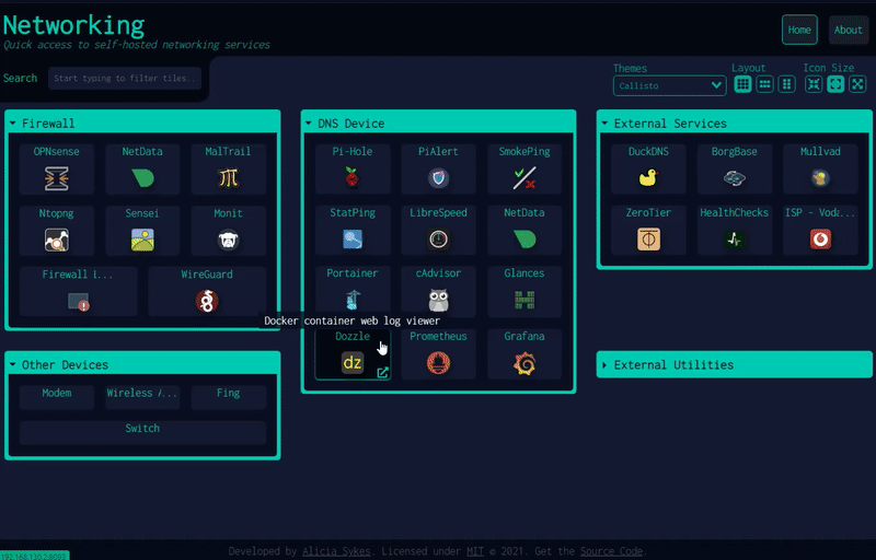
Dashy was the solution that stood out for my requirements. It’s a widget-based homepage with YAML configuration, supports custom HTML and iframe widgets, and is widely used in the homelab community. The architecture aligned well with what I needed.
What Dashy is
Dashy is a self-hosted dashboard application built with Vue.js and Node.js. It provides a widget-based interface where you can organize services, links, and custom content into sections. Each section can contain multiple items, and items can be links, widgets, or custom HTML content. The frontend is built with Vue.js, while Node.js handles the server and build process.
The configuration is YAML-based, which makes it readable and maintainable. Sections organize content into logical groups, and items within sections can have custom icons, descriptions, and styling. The configuration structure is straightforward and maps well to organizing services by category.
Custom widgets are a key feature. Dashy supports custom HTML widgets, which means you can embed iframes, Mermaid diagrams, or any other HTML content directly into the dashboard. This was crucial for my requirement to embed documentation diagrams.
The interface is clean and responsive. It works well on desktop and mobile, with a layout that adapts to different screen sizes. The visual organization makes it easy to find services quickly.
Resource requirements are higher than some alternatives. Dashy uses Vue.js for the frontend and Node.js for the server, typically consuming 200MB-500MB+ of RAM. This is more than lightweight options like Homer or Homepage, but still manageable for a homelab environment. The frontend is built during installation, and the runtime footprint is acceptable given the widget capabilities.
Dashy is actively maintained and widely adopted in the homelab community. This suggests it’s stable and well-tested. The active development means bugs get fixed and new features are added regularly.
Why Dashy made sense
I chose Dashy because it met all my requirements and had the right architecture for my use case.
The widget-based architecture was the deciding factor. Custom HTML and iframe support meant I could embed Mermaid diagrams from my documentation directly into the dashboard. This integration between documentation and the dashboard was important for creating a unified entry point.
YAML configuration integrates perfectly with infrastructure-as-code. While Dashy doesn’t automatically detect services, I could write a custom Python script to generate the Dashy configuration from my state/services.yaml file. This custom automation was necessary because none of the solutions could automatically discover all services from my infrastructure configuration. The script would generate the dashboard configuration, keeping it synchronized with service deployments, DNS names, and documentation links without manual updates.
The resource requirements are acceptable for my container architecture. While Dashy uses more resources than lightweight alternatives like Homer or Homepage, it’s still manageable in an LXC container. The one-container-per-service approach works well with Dashy’s architecture, and the additional resource usage was a reasonable trade-off for the widget capabilities I needed.
Active maintenance and community adoption provide confidence. A tool that’s widely used in homelabs and actively maintained is more likely to be reliable long-term. Regular updates and bug fixes matter when you’re building infrastructure you want to maintain.
The configuration structure maps well to service organization. I could automatically categorize services by type (Monitoring, DNS Services, Network Infrastructure, Storage, etc.) and generate sections and items from state files. The dynamic generation approach keeps the dashboard synchronized with infrastructure changes.
Setting it up
The deployment followed my standard architecture pattern. One LXC container running Dashy, Node.js installation without Docker, and integration with Traefik for HTTPS access.
Configuration generation required custom automation. None of the dashboard solutions could automatically detect all services from my infrastructure configuration, so I created a custom Python script that reads state/services.yaml and generates the Dashy configuration file. This custom scripting was necessary to bridge the gap between my infrastructure-as-code approach and the dashboard’s configuration format.
The script handles several tasks automatically. It categorizes services, resolves URLs from hostnames and certificates, discovers documentation files and diagrams, and generates the appropriate Dashy configuration structure. This automation means the dashboard stays current as services are added or changed.
Traefik provides HTTPS access with a wildcard certificate. The dashboard is accessible at homepage.vdaluz.net, using the same certificate management as other services. This keeps everything consistent and secure.
DNS configuration includes both public and internal access. The .vdaluz.net domain routes through Traefik for external access, while .lan provides direct internal access. This matches the pattern used for other services.
The configuration approach
Dynamic configuration generation was key to making this maintainable. None of the dashboard solutions offered automatic service discovery that would work with my infrastructure setup, so custom scripting was necessary. The Python script reads service definitions from state files and generates the dashboard configuration automatically, bridging the gap between infrastructure-as-code and the dashboard’s configuration format.
Service categorization happens automatically. The script groups services by type based on their configuration, creating logical sections like Monitoring, DNS Services, Network Infrastructure, and Storage. This organization makes the dashboard easier to navigate.
URL resolution is intelligent. The script prioritizes .vdaluz.net domains from certificate configurations, falls back to hostname attributes, and handles node-level certificates for multi-node services like Proxmox. This ensures the dashboard uses the correct access methods for each service.
Documentation integration is automated. The script discovers Mermaid diagrams from the documentation directory and runbooks from the runbooks directory, automatically adding links to the dashboard. This keeps documentation accessible without manual updates.
The approach follows infrastructure-as-code principles. Everything is version-controlled, generated from source of truth, and repeatable. This makes the dashboard maintainable and consistent with the rest of the infrastructure.
What’s next
The dashboard is now the entry point to the homelab, with automatic service discovery and documentation links. As new services are deployed, they’ll automatically appear in the dashboard configuration.
Future enhancements could include direct Mermaid diagram embedding. Currently, diagrams are linked, but Dashy’s widget support could allow direct embedding using iframes or a Mermaid rendering service. This would make diagrams even more accessible.
The automated configuration approach has worked well. The dashboard stays synchronized with infrastructure changes, and the YAML-based generation is maintainable. This validates the approach of generating configuration from state files.
Dashy has proven to be a good choice for a homelab dashboard. It’s flexible and integrates well with infrastructure-as-code workflows. While it uses more resources than some alternatives, the widget-based architecture and custom HTML support made it worth the trade-off. For a centralized service homepage, it strikes the right balance between features and capability.
Related reading

Researching monitoring solutions for a homelab
The process of evaluating self-hosted monitoring solutions, what I learned about the options, and why I chose Uptime Kuma for my Proxmox cluster.
Researching self-hosted game library consolidation
My games are scattered across Steam, GOG, Epic, Xbox, PlayStation, and a Switch. Before building anything, I went looking for a self-hosted, web-based way to see them all in one place. Here is what I evaluated, why nothing fit, and the custom build I talked myself into.
Self-hosting Backlogia, and fixing it before running it
Backlogia is a self-hosted app that pulls your game libraries from Steam, GOG, Epic and more into one place. Before I would run it I read the code, found four security gaps, and forked it. Then Starlette and a CORS bug had opinions too.
Ready to Transform Your Career?
Let's work together to unlock your potential and achieve your professional goals.