Generating living documentation from data to diagrams

After implementing schema validation for my homelab state files, I realized I had an opportunity. If the data is validated and consistent, why not generate documentation from it automatically? This led me to create living documentation that can’t drift from reality.
The problem with manual documentation is that it drifts. In my previous homelab setup, I maintained network diagrams manually. I’d forget to update them when adding new devices. Diagrams would show different information than the configuration files. I was maintaining both YAML configs and separate diagram files, which meant duplicate effort and silent failures when diagrams looked correct but were misleading.
I wanted documentation that automatically stayed accurate. If the data is the source of truth, the documentation should come from that same data.
From validated data to diagrams
The concept was straightforward. Generate diagrams from the same state files that are validated by schemas. This ensures diagrams are always accurate and never drift from reality. The same YAML files that define the infrastructure also become the source for visual documentation.
I created a script that reads validated YAML state files and generates Mermaid diagrams. Mermaid is a text-based diagram format that renders in Markdown, GitHub, and most documentation platforms. It’s portable, version-controllable, and works everywhere.
The script generates two types of diagrams. Network topology shows device connections, IP addresses, and VLAN assignments. Rack layout visualizes physical device placement and rack organization. Both come from the same validated data source.
The implementation follows a clean, modular design. The script loads state files, generates Mermaid syntax from the YAML data, and writes the diagrams to the documentation directory. It’s integrated into the pre-commit workflow, so diagrams update automatically whenever state files change.
What the diagrams show
Network topology diagrams focus on logical relationships. They show how devices connect to each other, primary IP addresses, VLAN assignments, and subnet information including gateways and CIDR details. The generated diagram reflects the network topology as defined in the state files, not as I remember it or as I think it should be.
Rack layout diagrams show physical infrastructure. They visualize which rack and rack unit position each device occupies, device types like routers and servers, mounting details, and organization grouped by rack. This gives a clear view of the physical infrastructure layout that’s always accurate.
Both diagrams are generated from the same validated source. When I add a device to the inventory YAML file, the rack layout diagram updates automatically. When I modify network configuration, the topology diagram reflects those changes. There’s no separate diagram file to maintain.
Integrating with the workflow
I integrated diagram generation into pre-commit hooks alongside schema validation. Now every commit validates state files against schemas and generates updated diagrams from the validated data. This ensures documentation is always current and can’t drift from reality.
This creates a self-documenting system. The documentation literally cannot drift from reality because it’s generated from the same files that define the infrastructure. If the data is correct, the diagrams are correct. If the data changes, the diagrams change.
A key design decision was manual staging. Initially, I wanted the pre-commit hook to automatically stage generated diagram files. But after researching this, I discovered that automatic staging in pre-commit hooks is considered an antipattern. When a hook modifies files and then runs git add, it can bypass validation checks that would normally run on the added file, or create an index state that doesn’t match the working directory properly. It also removes developer control over what gets committed, adds complexity to the git workflow, and interferes with partial staging and other git operations.
Instead, I kept diagram generation in the pre-commit hook but removed automatic staging. Diagrams are always generated and up-to-date, but developers manually stage diagram changes when they want to commit them. This keeps the git workflow clean and predictable without unintended staging behavior.
An important learning came from what seemed like a failure. During implementation, I initially thought the pre-commit hook was failing when it showed that files were modified by the hook. But this is correct git behavior. Pre-commit is designed to fail when files are modified but not staged, ensuring developers manually review and stage changes.
The proper workflow is clear. Pre-commit hook generates diagrams, detects modifications and fails the commit, developer manually stages the modified diagrams, then retries the commit with staged changes. This follows git best practices while achieving the goal of always-accurate documentation.
Challenges and simplifications
The implementation had some challenges. I initially tried to create an HTML preview system, but ran into CORS issues when opening files directly in browsers. Rather than building a complex workaround, I stepped back and simplified.
The key insight was to focus on generating accurate diagrams first, and worry about preview later. The Mermaid diagrams can be viewed in any Markdown renderer, GitHub, or dedicated Mermaid viewers. This simplification made the system more robust and portable. Sometimes the right solution is the simpler one.
Evolving to handle complexity
As I migrated more devices, I encountered challenges that required thoughtful design decisions.
Patch panel documentation was the first challenge. Initially, I tried to show patch panels as regular network devices in the topology diagram. This created visual clutter and didn’t clearly represent the logical versus physical network structure.
The solution was logical and physical separation. Network topology shows logical connections between active network devices. A patch panel table documents physical infrastructure separately at the bottom. This keeps the network diagram clean while still documenting physical cable routing. The connection details drive patch panel table generation, ensuring physical infrastructure is documented without cluttering the logical topology.
Rack layout optimization was another challenge. The initial rack layout was too verbose and didn’t efficiently use space. I made several improvements to make it more readable.
Compact formatting made diagrams much clearer. I changed from multi-line labels to single-line format showing device name, U position, and U size. This makes the diagram easier to read and understand at a glance.
U position ordering matches physical layout. I implemented descending order so the highest U positions appear first, matching how racks are organized physically. Anyone familiar with rack organization finds this intuitive.
Generic device grouping handles shared rack space automatically. Instead of showing four separate boxes for Raspberry Pis on a single 1U adapter, it shows them grouped: Pi1, Pi2, Pi3, Pi4 - U39 - 1U. This generic approach works for any scenario where multiple devices share rack space, not just Raspberry Pis.
Throughout these improvements, I focused on generic solutions rather than special-case code. The device grouping logic works for any devices sharing a U position. The patch panel handling works for any passive infrastructure. The compact formatting works for any device type. This makes the system more maintainable and extensible as the homelab grows.
The results
The diagram generation system provides automatic updates. Diagrams refresh whenever state files change, ensuring they’re always current. Consistency comes from using the same data source for validation and visualization. No manual diagram maintenance is required.
Reliability improves because documentation can’t drift. Version control tracks diagram changes alongside data changes, so the history shows both together. Portability means Mermaid diagrams work everywhere, from GitHub to local Markdown viewers to documentation sites.
Building data integrity into the foundation changes how documentation works. Instead of hoping diagrams are accurate, you know they are. Instead of manually updating diagrams when infrastructure changes, the diagrams update automatically. It’s a small change in approach that makes a big difference in reliability.
This diagram generation is the beginning, not the end. The next logical step is creating a local documentation website that serves these diagrams alongside other homelab documentation in a user-friendly interface. The foundation is solid: validated data that generates accurate diagrams automatically. Now I can build a web interface on top of this reliable foundation.
Related reading

Building data integrity into homelab documentation
How JSON Schema validation and automated checks prevent configuration drift in homelab documentation, and why starting with validation changes how you think about data.

Researching monitoring solutions for a homelab
The process of evaluating self-hosted monitoring solutions, what I learned about the options, and why I chose Uptime Kuma for my Proxmox cluster.
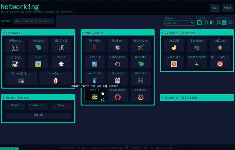
Researching Homelab Dashboard Solutions and Choosing Dashy
The process of evaluating self-hosted homepage solutions for a homelab, what I learned about the options, and why I chose Dashy for a centralized service dashboard.
Ready to Transform Your Career?
Let's work together to unlock your potential and achieve your professional goals.